Here I thought id share some of the choices or reasons why I chose the projects I did.
First ill start with the Slipknot CD Cover. Originally the project was to do nine different color themes and, the other students would pick. Well, out of the nine I did, for some reason, they voted for an all-pink one that was the color of raw meat. After they chose that one, I was to go back and redesign it. Which I did and, you can find it on my home page. I think the design I did speaks well for the cd.
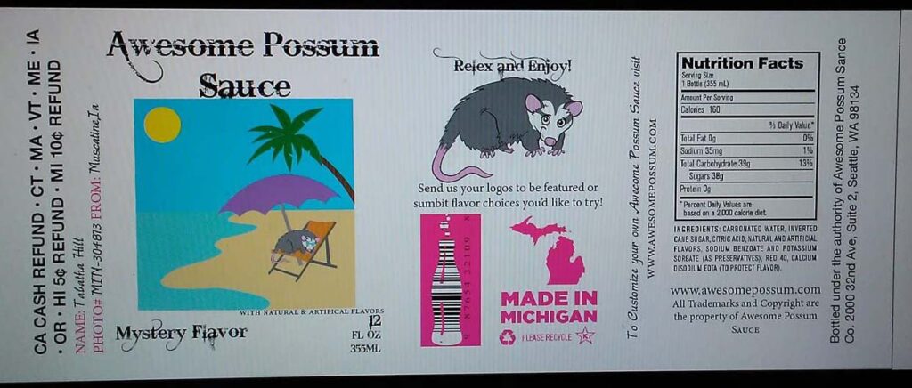
The second project is my soapbox. We were supposed to come up with a name for soap. I chose the name “Grumpy’s Soap” with the tagline “Washes the grumpies down the drain”. I chose the name and tagline because 1. Grumpy Bear is my favorite Care Bear and 2. I just had my son and he was kinda grumpy with bath time so it worked out. The point of the project was to teach packaging design. Which I ended up liking. I also did a box for an NFL glass, a cereal box, and a beverage label.
The third project is my pop art houses. This was a series of five photos. Each photo was a collage of four pictures all of the same style. The five styles I did were Queen Anne, Tudor, Four Square, Victorian, and English. All the homes were in either Muscatine, Iowa City, or Davenport Iowa. I chose houses because I love big huge homes, plus the older styles have their own uniqueness to them. Their own story and character that you just can’t find in today’s cookie-cutter houses.
The fourth project is my “5 things” video. This was to teach little video editing. I was supposed to pick five things about me. I did a good job summing it up and, I think it turned out well. Unfornturly I had to work with what I had. Some of the things in the video are not currently with me. So I made the best lemonade I could with the lemon I had.
I think the fifth and final project will be my Collectors of the Month Newsletter. This one was part of a semester-long project. I chose to do a toy line instead of a business. Doing a toy line did prove to have its challenges. But I think the newsletter came out well. It was a three-page newsletter with text and photos. I didn’t have to write the text but I chose to. I felt it gave the newsletter and photos a good link to each other and to other projects that were done over the semester.
Overall, I hope this gives you a decent insight into why I chose them and shows that I can do more than just photography or just design.